Alright, alright, I get that unsolicited redesigns are often unpopular! But sometimes the changes are so glaring, like the new Google sign-in interface, that it’s almost painful to use. For the record, I really enjoy Google products and use them every day.
In the US, the average daily screen time, encompassing all devices and media, is around 7 hours and 3 minutes (source: backlinko.com). Given these statistics, it’s crucial to design user interfaces that are easy on the eyes. Thoughtfully positioning user interface elements can help users complete tasks more efficiently, enhancing their overall experience.
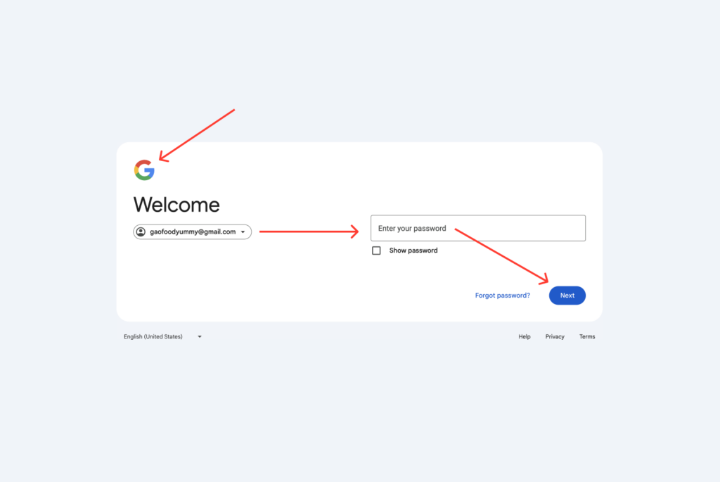
Examining the new Google sign-in form, we notice it has very few UI elements, yet navigating through it feels unnecessarily time consuming. With an average daily screen time of 7 hours, my eyes are already strained, and the cognitive load for task performance (measured by accuracy, error rates, and completion time) is significantly high. Why make it more challenging, regardless of the number of steps required to complete the task?

Gutenberg Principle
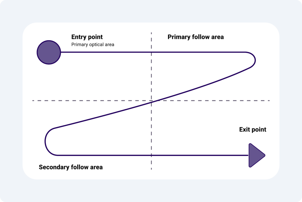
Google may have designed this UI with the Gutenberg Principle in mind. This principle suggests a reading path in a “Z” pattern: starting at the top-left (Primary Optical Area), moving to the top-right (Strong Fallow Area), descending to the bottom-left (Weak Fallow Area), and ending at the bottom-right (Terminal Area).

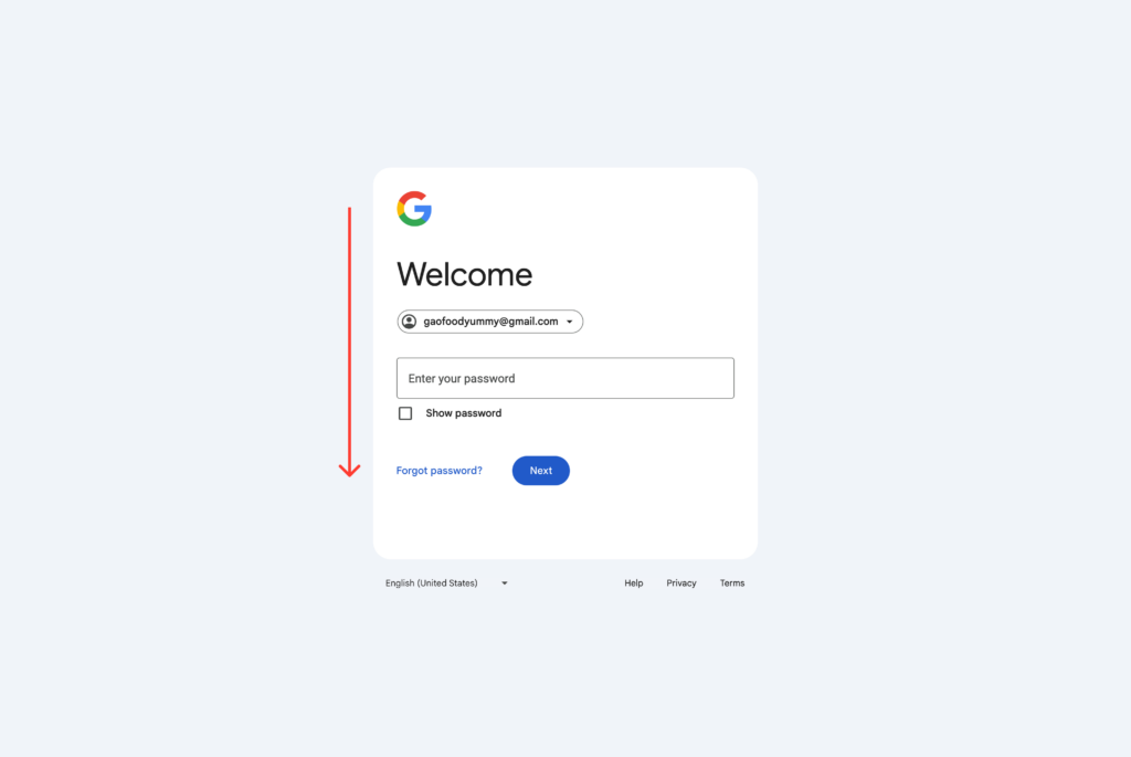
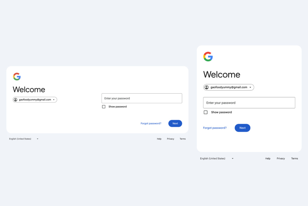
While we may not be aware of the constraints and compromises faced by designers and developers, a vertical alignment seems much easier to scan. This way, my eyes don’t have to make wide sweeping motions to take in a few elements.

Comparison

Google typically invests a significant amount of time testing new designs before releasing them to the public. This process includes multiple phases and extensive testing methods, such as internal, closed, and open testing stages. Throughout these phases, the software is subjected to various tests, including functional, performance, security, compatibility, usability, and regression testing. Each type of test targets different aspects of the software to ensure it meets quality standards and user expectations.
I look forward to seeing how this UI might fit into the bigger picture someday.